the design
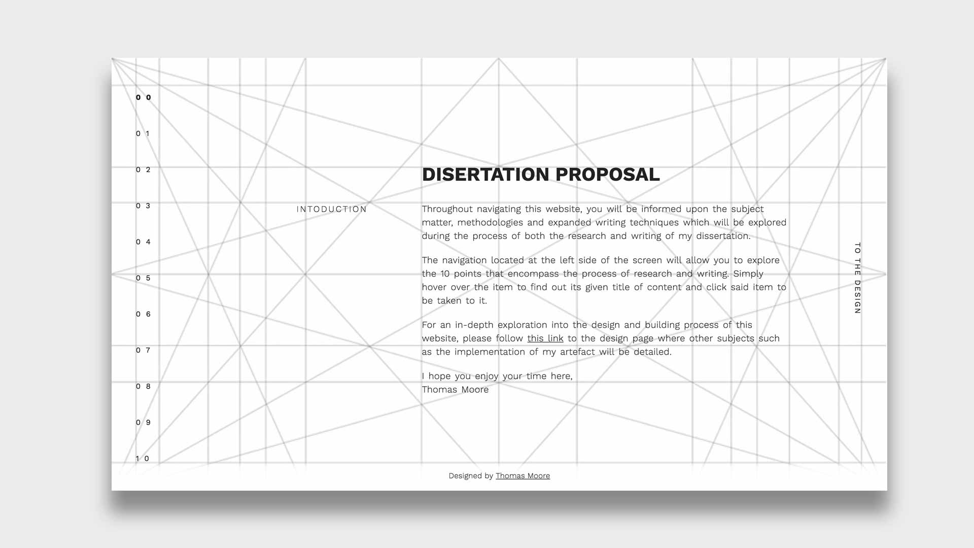
This website strives to produce a clean and minimalistic design focusing on readability; with the aim to convey the necessary information for a dissertation. The piece itself draws inspiration from a variety of design sources being in both web and print. Firstly, the following section will describe said sources of inspiration and the ways which they were incorporated in the final piece.
website
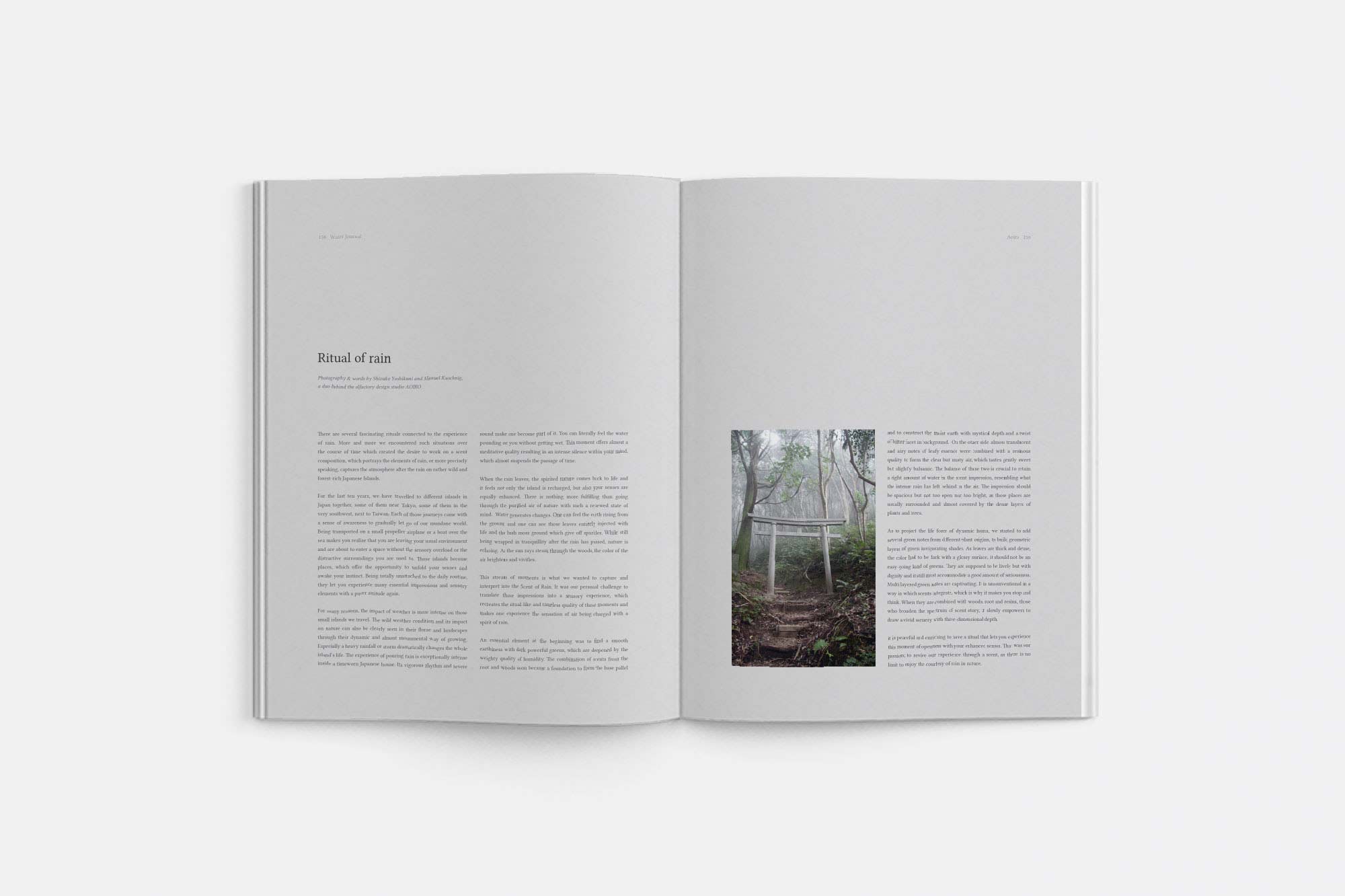
I have been referencing Water Journal quite often in recent work due to my increased interest in modern minimalistic design. As you can see the print itself focuses heavily on the position used in its presentation. This liberal use of whitespace allows content to gain great amounts of focus; designing not only a beautiful layout but also providing punchy emphasis to the written content and the meanings behind it. Click here to visit Water Journal.
Web designer Alexander Plyuton is known for producing an extremely versatile body of work when it comes to web style. His piece for ZIPL v 3.0 encapsulates minimalistic design at its finest in my opinion; with bold weighted text being dominant throughout and a colour pallet of nothing but off-black and white. You can view the design itself on Behance.
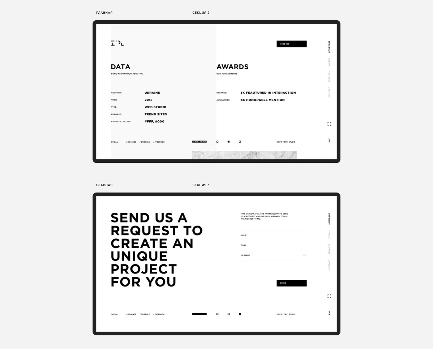
Alexander's use of the Golden Grid inspired me to do the same: allowing objects to be completely relevant to one another but still maintaining strict use of whitespace.
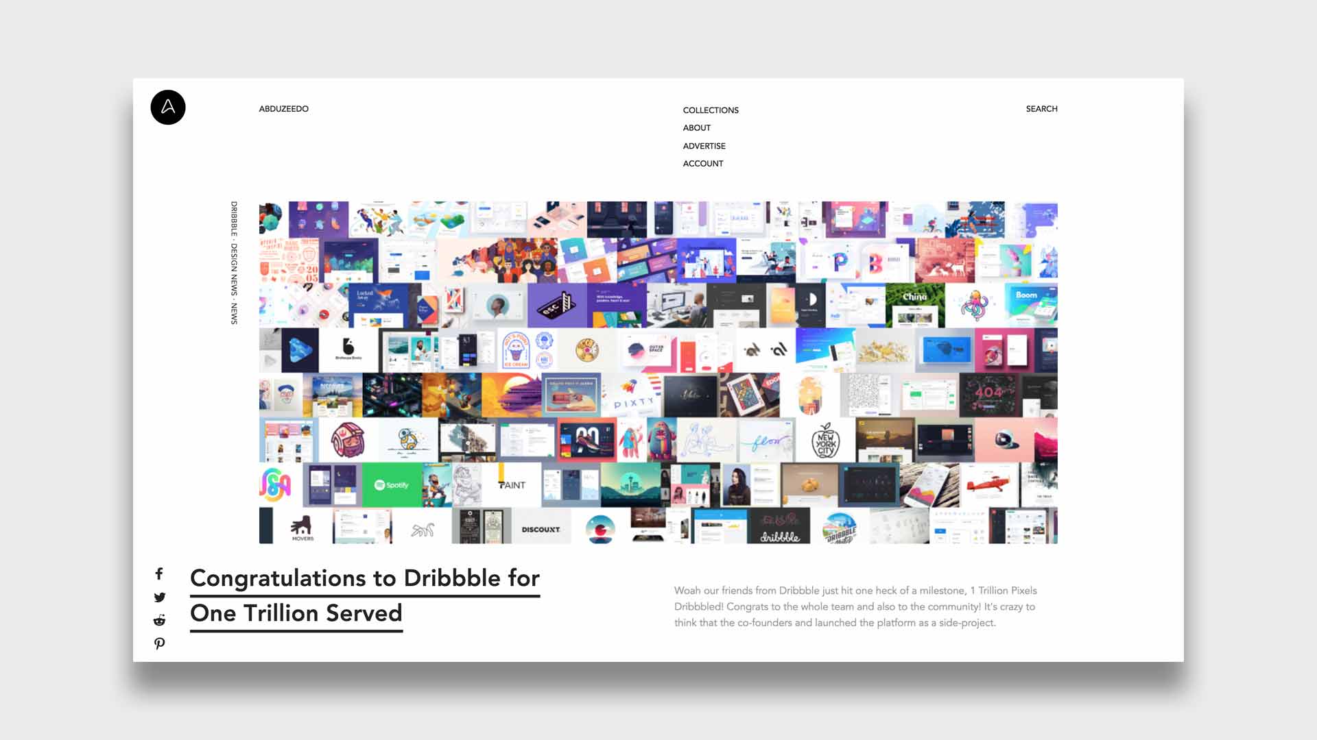
What started as a personal blog, Abduzeedo, a website that shares articles about architecture, design, photography and UX, has now become a leading platform for the distribution of inspiration material. Abduzeedo itself was the inspiration in my case. I find the website's UI incredibly easy to use while sporting an attractive minimalistic style. Articles themselves use text placement to positively affect the reading experience, using only the most necessary text to give the user what they really need. why not take a look at Abduzeedo.